Studio News
Rebranding thirteen23
Bringing our team together to create a brand language that reflects who we are and what matters to us
By
Natalie Vanderveen
—
11
Jul
2022
A brand that reflects us
After moving to a new space, bringing on some new teammates, and exploring what it means to connect in a new, remote world, we were inspired to take a fresh look at our brand to see how it could evolve to truly reflect who we are now.
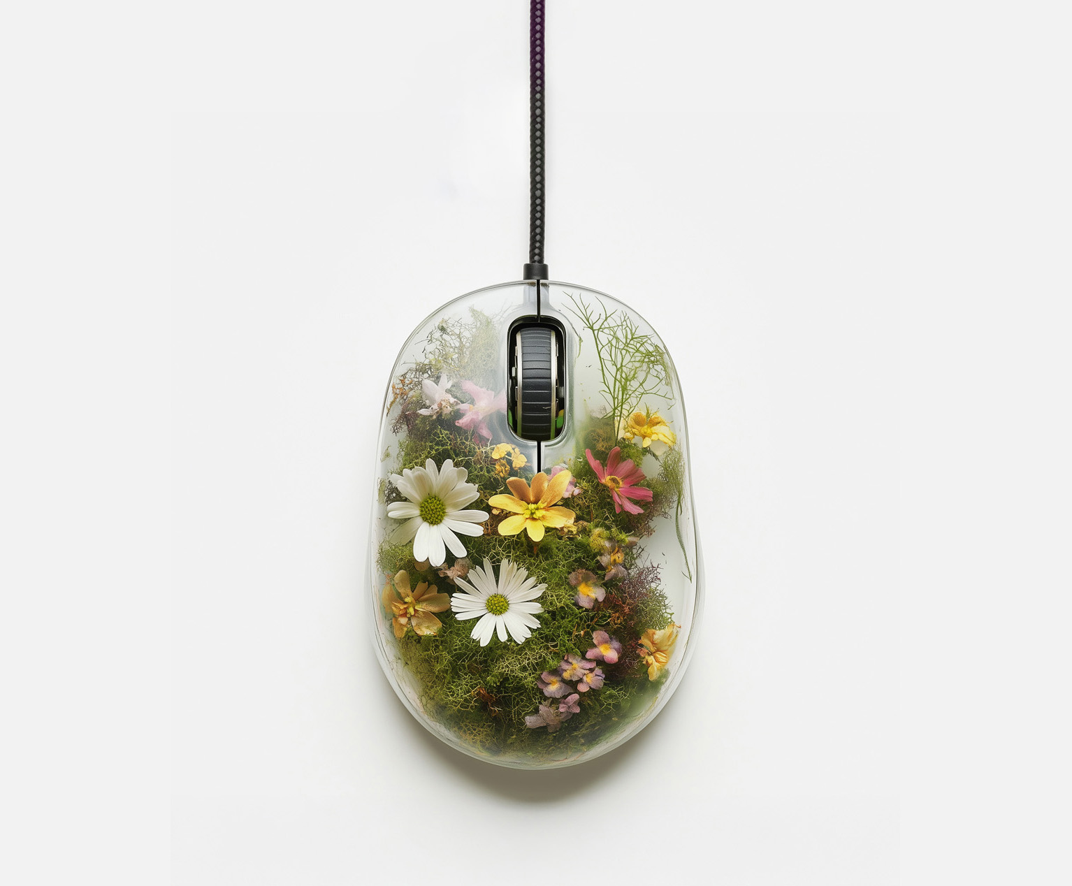
In our new brand, we find inspiration in nature as an expression of art and science—looking at tones, textures, and brand elements that balance soft, organic expressions with technical influences.
Most importantly, this brand is a result of each person who works in our studio. From full team brainstorming sessions, to design sprints that brought in the ideas and hands of each designer on our team, our updated brand has been built by everyone in our studio and truly reflects who we are as a team. We're excited to share it with you.
Defining who we are
From the onset, our objective was to bring our team together to define our brand language and align on a direction for our new visual identity system. To kick off this effort and ensure we were hearing from everyone in the studio, we ran a full team workshop to discuss who we are as a company and determine what our team was responding to visually.
We pulled the team into Miro for some workshop activities where we discussed our company values and attributes. We also spent time looking at curated visual inspiration, and talked at length about which images felt true to thirteen23.

Collecting equal input from everyone on the team allowed us to shape a clear and rich vision for our re-brand. We ended the workshop with the seeds of a new visual direction, and a shared understanding of the character of our work and how we see ourselves as a studio. We defined ourselves as authentic, approachable, and inspired, with work that takes cues from both the organic and technical.

Expressing ourselves
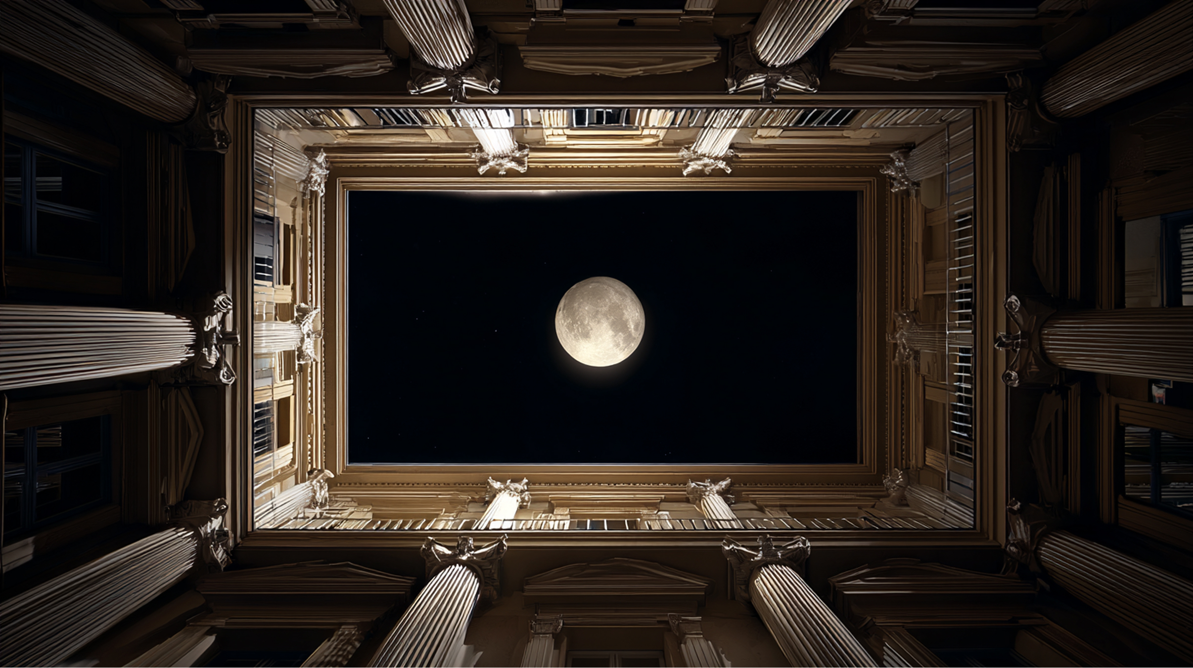
We wanted our brand to have a defining hero element that speaks to the duality of design and technology on which we’ve built our foundation. We referenced insights found during our rebranding workshop and pulled out some visual descriptors, like organic, fluid, and expressive to help guide the design direction.
After exploring a few different visual routes, we quickly realized the harmonograph, an expression of art and science, was our most successful direction. Harmonographs are geometric images created by a mechanical apparatus, which uses pendulums to control the movement of pens on a drawing surface. When the frequencies of the pendulums are manipulated, a new harmonograph is generated, creating an infinite collection of illustrations that feel flexible and energetic.

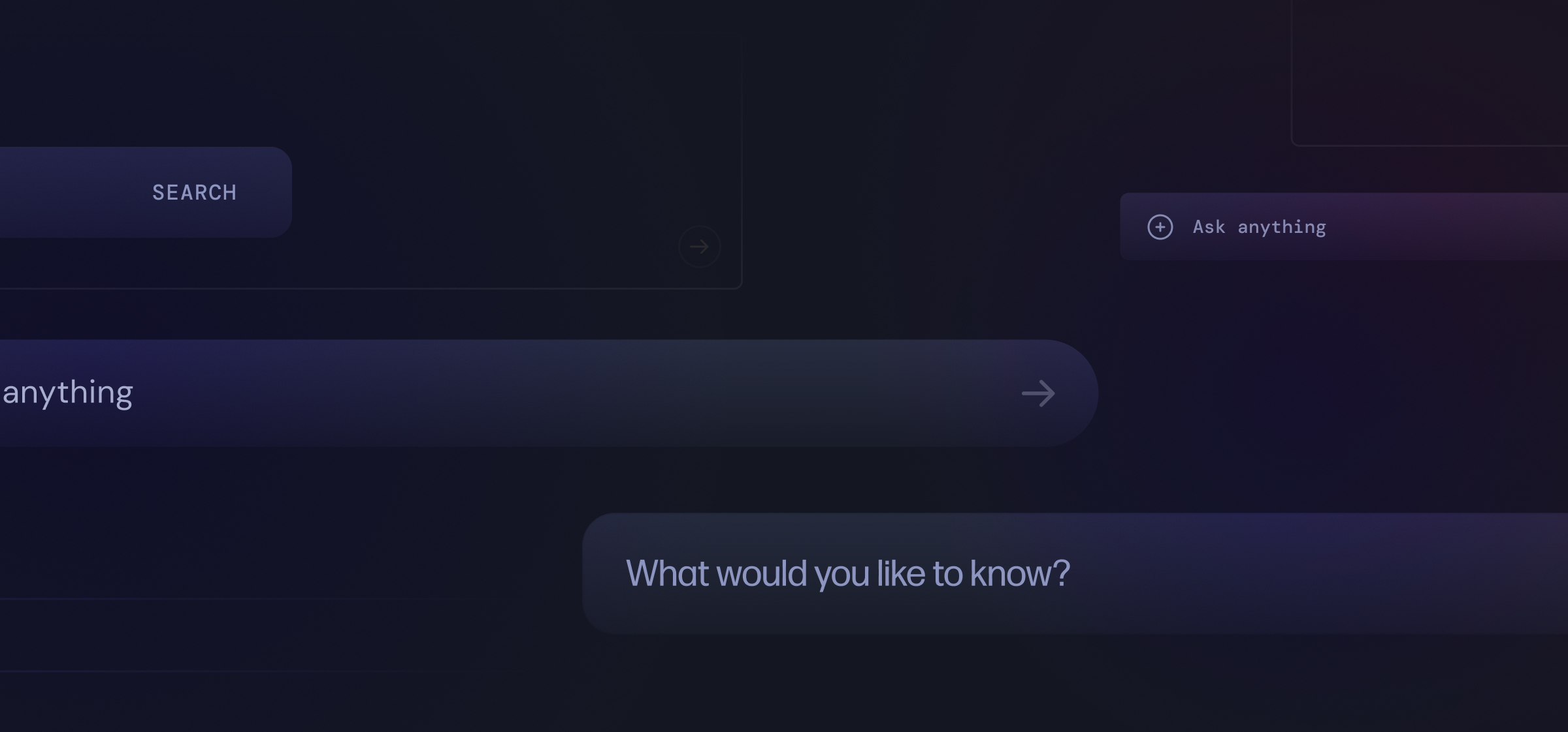
Our new site
Designing our website was a great opportunity for us to introduce our new brand to the world as well as validate the insights gained during our workshop. Our new site gives us the ability to showcase our new brand language, while including immersive case studies, and a more accurate reflection of our people and our work.

While having a strong point-of-view, our new brand is designed to evolve with the designers who continue to touch it. It is a direct result and reflection of each human at the heart of it all, and we’re looking forward to watching it grow and evolve over time.


Natalie Vanderveen
Natalie Vanderveen is a Senior Designer at thirteen23, creating digital experiences and products for clients such as Kohler, Bose, Dell, and Experian. In her limited free time, you can find Natalie immersing herself in the rich culture of reality TV.